Tuesday, 1 December 2015

Animation Studio Research: Follow up Networking

Since my presentation I have started to look at trying to gain connections with people that work at DreamWorks. I have attempted to connect with some artists on Linkedin - I shall post my progress with them if I see any - but I don't want to stop there. I'm going to set myself a target to get into the routine of spending just a few hours a week doing some SERIOUS social media networking, whether this be on Twitter, Linkedin, Instragram, the lot. I don't want to just limit myself to this one company, instead I shall reach out to different people that work for different animation studios that I am interested in. I hope to build my network, but also try to get some advice and information about work along the way.


Update:
A while back I was able to get in contact with a girl called Elie on Twitter, who is a skin concept artist working at Riot Games, a company I am very much interested. I knew of her because my Boyfriend had met her at an event the company held in October time of 2015, and I used this as a grounds to introduce myself on. She was very happy to answer the questions I had about her work and what it was she did, and she also gave me advice and tips with my own practice.


I found it interesting to know that she believes it better to master a skill first and then branch out, especially as I have had mixed responses when it comes to that area. I think it would be nice to have a specialty, but as it stands I'm still not 100% certain on what it is I want to do, so I shall continue to explore until I find the thing that is right for me.

Animation Studio Research: DreamWorks Animation

As part of our study task we were required to choose an animation production studio to make a presentation on. As well as talking about the studio's history and key works, we had to demonstrate that we had made an attempt to contact the studio or some of it's employees, in an attempt to expand our network.

The twist with this task is that we were not allowed to duplicate studios, and were required to post on our animation forum/board which studio that each of us were going to look at. I attended the party too late and the studios I had in mind had already been assigned (for example, Disney, Aardman, Pixar, your general larger studios). It was a hard task for me to think of another studio that I was interested in, and there weren't a lot of small studios that I was aware of, so I literally looked through my library of animated feature films in my DVD collection until I found one made my a company that hadn't already been selected.

That company just happened to be DreamWorks, and the fact that it hadn't already been selected shocked me a little as it's a very large company that has produced some very successful movies. I was happy to proceed with this company as it had produced some films that I am very much fond of. Whether they are a company I would like to work for is a different matter, especially because I'm not sure what it is I want to do yet but CGI is definitely one of my interests at the moment so that's a start.

My Presentation Slides

I made a start on trying to contact the studio before I made the presentation, and on the DreamWorks Animation website I found an email that I could contact. In the email I outlined briefly who I was before I went on to ask if there was any information they could provide me with regarding things like internships and what they personally look for in new employees. When I put the slides together I included a screenshot of my email and at that point I had not received a response, though when I came to give my presentation today I had, though sadly it was just a generic stock reply:


I feel the presentation went well and this opinion is solidified by Martin's feedback, who outlined that I had undergone good research and had a good focus on twitter and social networking. He suggested to me that I should look at Linkedin profiles and have another go at emailing different "folk" which is just what I plan to do. I would like to have a genuine response to some of my questions, and it can never hurt to build connections, even if I can't really picture myself working for DreamWorks. 

Friday, 27 November 2015

Manchester Animation Festival: Tim Searle's Masterclass

I think this presentation was by far my favourite event of the whole festival, and I think it's mostly down to Tim's character. From the get go (or rather not, considering he experienced technical difficulties before he had even started) you could see that he was a down to earth guy which made his presentation very interesting and entertaining to watch, and not only this but I found it to be very beneficial.

Like most of the other speakers, Tim started off by telling us about his background and it was interesting to learn that he was initially studying Photography at Farnham. He got into animation by going to Annecy "for the laugh" which "changed everything" as he discovered he "needed to entertain". From here he worked on a number of different projects with a number of different companies (including Triffic Films, Baby Cow Animation,Viz) before he began working at Tiger Aspect Productions (previously known as Tiger Television) and working on Mr Bean.

To make it an "official Masterclass", every so often Tim would throw in some top tips, these are a select few:
- Don't be a dick.
- Keep your shower short.

On a more serious note:
- Create a business plan. Be aware of finances and keep cash coming in.
- "How many times have you heard 'I can't draw'". It all requires PRACTICE. Don't rush straight to the computer, instead draw first as "the illusion of it being all natural" takes practice.
- Be an enthusiast. "If you're going to do it, DO IT".
- Have a plan.
-Take a few chances.
- COLLABORATE, and again, don't be a dick.

In all seriousness though, his points were very valid and this talk - as well as the majority of the others I attended this year - have really stressed the importance of getting your work out there and showing your enthusiasm in the animation world. To put this to the test, I approached Tim after the talk hoping to chat with him and I was lucky to do so. He was a very friendly man and was happy to answer all of my questions. He told me that it's not so much as important to specialize but to do whatever it is you're doing well, and advised me to keep my animations short and precise and to not try stretch my resources too far. It's better to have a short, well made animation than to try to make it seem more impressive by making it longer and dimming the quality.


I have since added Tim Searle on Twitter and he is now following me too. He also requested to see my project once it is finished, and I can't wait to show it to him!

Manchester Animation Festival: Making it in Manchester

Speakers:
Phil Chalk - Factory
Leo Casserly - Flix Facilities
Chris Bowden - Mackinnon & Saunders


The Making it in Manchester talk that I attended on the Tuesday was also really insightful. The speakers all talked about their experiences and how they made their way into "this crazy business" and I found it really useful to hear about these different ways. It seems that the general theme running throughout these talks is to just get your work out there, but here are a few more things that I took away from this talk in particular:

- Don't say no. (Debatable depending on the client and the brief, but on a whole don't say no to projects. Some maybe a little challenging and different to the work you're used to doing, but it is all experience and it gets you doing work and building your skills).
- It "doesn't hurt to have more than one string to your bow". Not all clients are looking for someone who is specialized in one area, sometimes it's also useful to know how to perform in a variety of different areas.
- It isn't always about "raw talent", sometimes it's about the understanding or being able to project manage. Sometimes it's about the CHARACTER.
- "Get your foot in the door, it's a people business".

On a slightly different note: It is very rare that you see text in a pre-school animation and this is so it can be easily translated for other languages and countries. This also means that there doesn't tend to be puns, instead the humor is more universally understood.


This talk definitely made me feel less worried about not knowing fully what I want to do/specialize in, as it was made clear that different people are searching for different things, and in front of me sat animators/creative professionals some of which had a variety of different skills under their belt.

Machester Animation Festival: Will Becher's Masterclass

On Wednesday, I attended Will Becher's masterclass and it was truly fascinating. I had always loved watching Aardman's work growing up, so it was great to hear what Will had to say. I know I had met Peter Lord at BAF last year, but Will showed a lot of clips that were from 'behind the scenes' and the inner Aardman-fangirl in me was unleashed once again.

Will went into a lot of detail about how the puppets and sets were made, and how important it was to make them as sturdy and solid as possible. They would do a lot of planning ahead to make sure they would only make what they needed to in order to be time conscious, but also think about the camera camera angles they were going to use and how they would maneuver in more awkward sets. This usually meant making the sets which detachable parts so they could make their way around the set.

Positioning Models on a Shaun the Sheep Movie Set

Will talked a lot about the company's history and their production progress (he would tell us things like they would typically animate 3 seconds a day on the Shaun the Sheep movie) but the part of his presentation that I found most interesting was the section on Live Action Video. Sadly I don't have an clips that I can show as we were asked not to photograph this section of the presentation, but it was great to see where the team got their references from. Usually the producer and other members of the team would act out different scenes so that they could "capture the essence of the performance". You can tell that this was a huge benefit for the team as the animation clearly captures the emotions that were acted out in the LAVs, and is definitely something I'm going to take away from the presentation. Not only does it look like a great way to collect reference material that is going to benefit animating, it also looks like a lot of fun and a good way to interact and build relationships with co-workers. Hopefully one day I will have built on my confidence and people skills enough that I can be as crazy and outgoing as the people displayed in the LAVs that we were shown.

Will ended on a note that can be summarized in just one sentence; GET YOUR WORK OUT THERE. He said that he got his job at Aardman by being persistent and ever so lucky. By showing his enthusiasm and persistently contacting the studio he was able to find work as a runner where he got experience in model making and it was from here that he was able to work his way up.

Monday, 23 November 2015

Manchester Animation Festival: Making Friends and Animating People - The Art of Crowd Funding

This is an event that we didn't actually have a ticket for, but we had a lot of time throughout the day to ourselves and I thought this event sounded like it would be benefical to me so I picked up a ticket and attended the talk. I was hoping it would be more about how to approach people and networking, but it was very much focused on crowdfunding. Though it wasn't so much what I was expecting, I can definitely see the information I received being useful/helpful for in the future, not so much now as I'm not in a position where I need to raise money to complete a project.

The talk was presented by Emma Burch, Merlin Crossingham and Jon Turner. Emma started by introducing herself and explaining how she and the rest of her production team were looking to raise money in order to produce a Simon's Cat film (Off to the Vet). They were debating whether to go with Kickstarter and IndieGoGo and in the end went with the latter as they thought their system worked better for them. She then went on to dicussing budgets and how you can work them out so that they are sensible.

 Emma's Slides (Terrible Quality Photos, Sorry)

Merlin spoke next. Merlin Crossingham is a director at Aardman and he spoke about their Kickstarter campaign to Bring Back Morph. The crowdfunding came about because they were getting a lot of suggestions from fans to see new morph episodes, so they put out the campaign and it was their pitch video that sealed the deal for them in Merlin's eyes. They were able to reach their target budget within 8 days of starting the campaign, and were able to do this as they received good publicity from different newspapers but also because they were giving good rewards to their backers. Everyone that gave a pledge received access to a production blog so they could see behind the scenes footage and production, but you could also get yourself some special gifts if you pledged a certain amount of money, for instance old plasticine that was once an Aardman model, T-shirts and even a tour around the studios.

Aardman Kickstarter Pitch

The last to speak was Jon Turner from Kilogramme. He had started a campaign on kickstarter as he was interested in producing a part two to his Tall Tales 'series', and needed funding in order to do it. He thought the crowdfunding route worked the best for him and his company as with crowdfunding he had complete creative control; He didn't have to work towards the needs of a client, but instead he had pitched an idea and questioned his audience "do you want us to make this?". He knew the audience was out there from the success of his first animation, but by pitching the second idea he could get a general idea of who would be interested in seeing it, and the pledges on kickstarter confirmed this. 

 Tall Tales 2 Trailer

The presentations were really interesting and informative, and it made me realise that crowdfunding could be an option for in the future as it's not something I had thought about before; I hadn't needed to. The answers to the crowd's questions were just as helpful too, as it made me realise the benefits and issues of using crowdfunding. For instance, I found that it may not always be useful to use crowdfunding, as it can depend on the time you have and what you are wanting to do. People are more likely to back your idea if it is DIFFERENT and NEW, and whether your idea is interesting and well pitched. The panel had a mutual thought that you had to wait a while inbetween each crowdfunding campaign too. 

Manchester Animation Festival: Masterclass with Tomm Moore

Today marks a very good start for MAF, and I definitely think that listening to Tomm Moore's presentation has been the highlight of my day. The graduation film screenings were lovely to watch (even if some were quite weird to say the least) and it was interesting to see what is happening currently in the world of animation outside university, but I think Tom's presentation was the most beneficial to me/the event I was most interested in.


For starters I learnt more about the company he works for - Cartoon Saloon - which was formed in 1999, and once we had learnt a bit about this background and their first feature film, Tom went on to talk about "Song of the Sea", the company's second film. I was absolutely blown away. The film looked absolutely stunning and I'm actually upset that I haven't already seen it. 

I found it really interesting to learn about some of the decision making that was undergone, and more about the process of making the film. I would really like to try to talk to him more about this, so I hope he sticks around for the remaining days of the festival as I didn't get the opportunity to speak with him today. If not I shall ask him on his social media that he provided (which I am now following) to show my interest and to hopefully gain some more insight.


Update: Unfortunatly Tom didn't stay for the remainder of the festival as he flew out to LA for another event, which is a shame as it would have been really interesting to chat with him about his work. Still, I really enjoyed his presentation and it was uplifting to know that he isn't too great with perspective drawing (he said this himself, this isn't me critising him) yet he has still been able to produce an amazing feature film. I should really try to not get worked up over my weaknesses, instead try to improve them where possible, or just play to my strengths. 

Tuesday, 3 November 2015

Golden Rules of Social Media

In today's PPP session we talked about the importance of having presence on social media sites, and how we need to start thinking about keeping our professional and personal lives separate. We were considering what social media we already have and thinking about how we could use these websites to help us in our studies/career paths.

Our agreed 'Golden Rules':
- Associate with care. If we allow certain people to associate with us on sites, this could allow access to our profiles by people we want to keep our information private.
- Post carefully. Be positive.
- Post Frequent.
- Post Relevantly.
- Consider the work you choose to document/post.
- Build and maintain using all of our accounts, not just one.
 -COMMUNICATE.

The session made me reflect on my own social media. In the holidays I had actually set up a couple of blogs/social media but it openned my eyes to keep using them all. Now that I have an Instagram account I tend to update all of my other social media (Tumblr, Twitter) through this app when I post updates of work, when really I should think about posting separately BUT cross reference my different sites.

I have also revisited my Facebook profile that I use personally, and made sure that my privacy settings are set to friends rather than everyone. By doing this I can keep my details and personal life private and more importantly keep unwanted information away from potential employers or professionals if they happen to try and find out more about me.

I am also going to create a Linkedin account so I can build up a network of professionals in my field of interest, and use it to potentially communicate with them to help build said network.


My aim is to continue to use my social media sites, but to make sure I post more frequently.  I also aim to at least try to double my follower count on said sites by posting often and expressing my interests in my field of work.

Tuesday, 20 October 2015

Personal Development Tools and SWOT Analysis

In our PPP seminar we looked at the development tool that is known as SWOT; our strengths, weaknesses, opportunities and threats. We looked at these characteristics in ourselves then looked at how we would be able to develop these and play our strengths to help us as practioners, but not just our strengths and weaknesses in general but in specific areas; Personal, Interpersonal, Technical ad Artistic.


I found it quite hard to think of things to write up, but once I had started to really think about it I was able to think of things that I thought were fairly accurate. Generally I found that;

Strengths: Good listener, I don't leave things until last minute, easy to work with, comprehensive, 3D modelling, digital work is improving, good at working with computers.

Weaknesses: Confidence is lacking, A bit of a work-a-holic that can cause me to stress even when it isn't neccessary, my communication, drawing characters in different poses and drawing correct perspectives.

Opportunities: I can drive so I have the opportunity to travel to events and festivals easily, finance doesn't necessarily hold me back, good at social networking in the sense that I get my art work out there and across a number of different websites, critiques.

Threats: Prone to stress out easily, go through periods of putting myself down, lacking in confidence, mental 'wobbles', not knowing how to approach people to create networks, competitors.


Once we had done this we had got into groups to find out what other people thought our SWOTs were, as practioners it is common to overlook strengths and ignore weaknesses. A common strength that people had pointed out was that I was good at technical things such as Maya which was nice to be told, not only because it is something I have recently picked up but because it is also something I am interested in taking further. Ciara also suggested that I try out Maya without the instructions/tutorial, which is a fair point and it is something that I am planning of doing (not just because my brief requires me to).
A weakness that had cropped up in all three of my assessments was that I get distressed too easily so it's obviously something that I need to address. It's also been made clear to me that I need to try harder on approaching people and starting conversations with others as this was again something that all three people had picked up on. It was obvious to me that this is something I needed/wanted to change/address but I hadn't really realised that it was so obvious to other people that I'm cripplingly shy and find it hard to get the conversation going.


I found today's seminar extremely useful and it was nice to see that others are agreeing with my strengths. It's also made me think about some other areas that I hadn't even considered myself to be good at. It's given me a clear guideline of things that I need to work on, and what would be beneficial to me to continue to practice and build on.

Tuesday, 13 October 2015

A New Year: Who am I now?

What have I learnt so far?
I've learnt so much in the past year that it's quite overwhelming. I've actually got some knowledge in all of the areas that I set out to learn about at the start of my first year; I've learnt how to create animations in different programs such as After Effects and Photoshop, as well as touching on how to use some Maya tools. Not only this but I've learnt that sometimes it is far easier to use a combination of these programs to create animations as they have different strengths and weaknesses.
I've also learnt how to properly render my animations, and learnt more technical aspects such as frame rate and frame ratio, which is something I didn't consider when I was first starting out at foundation level.


What do I want to know more about?
Now that we're back we have started a brief for Studio Practice that is looking at creating Maya 3D models, and so far I'm really enjoying it. I only know the basics of Maya, but I'm hoping that as the brief progresses that my knowledge will widen along side it. Maya is something I wanted to explore when I first started University as the idea of 3D work has always interested me, and now it is potentially something I'd like to pursue.
I'd like to learn more about the creative industry and how I can get my work out there, as well as other things like properly pricing myself and my work. It's not something I have ever thought about and I wouldn't know where to start (other than uploading my animations to YouTube and other social media) and I feel that this would be something that would benefit me greatly. Not only this, but I would like to start attending animation conferences and festivals to experience first hand what is happening in the world of animation and practice getting involve in it.
I'd also like to learn more about lighting and how it can be used to change the atmosphere of an animation. On a similar note I'd also like to learn more about the influence that colour can have, and how I can use both of these aspects to change how the narrative/character is perceived.


What are my strengths?
I'd definitely say that working with computers is a strength of mine, especially creating 2D animations in programs such as after effects. I got a lot of practice at this in my first year so I'm getting more comfortable producing work in this way. I've also got better at understanding what the tools do in both After Effects and Photoshop, and I know when they're appropriate to use.
I'd also say that life drawing is another one of my strengths. I really enjoyed the briefs we were given in our first year where we were to look at the human form, and I'm hoping that we will be given some more, and if not I'm definitely going to continue life drawing as not only do I enjoy it, it will benefit me and my work greatly.
Project management is also one of my strengths, or at least it is becoming one of my strengths. I've never been one to leave all my work/blogging to end and rush to get it finished before my deadline. I'm good at keeping on top of my work, but i'm not good at allowing myself to take a break. I definitely improved on this towards the end of my year, but I've still got a way to come yet.


What do I want to improve?
Following on from my last point, I want to improve on my outlook of my working practice. I need to allow myself to take breaks and not stress out about little things. Having said this though, I do still need to keep on top of blogging about the lectures I attend, as this was the one area that I seemed to leave more towards the end, which sometimes made it difficult.
Animation wise, I would like to continue to build my existing skills in all the computer programs that I have been using over the past year, to hopefully continue to create successful animations. In order to do this I feel I also need to practice drawing characters in different poses and from different angles. I feel this is one of my weaknesses, as I tend to design characters head on and just in a normal standing position. I sometimes find it hard to visualise how they would look from different angles, so I definitely think life drawing and practicing sketching will help with this. On a similar note, I would also like to improve on perspective drawing and drawing more accurately in terms of proportions and angles.
As said before, I want to improve on creating lighting in my work. For starters I would like to create a greater atmosphere in my animations through the use of lighting and colour, but I would also like to learn how to use lighting better in Maya as well. I know vaguely how to create different lights and how I can direct them and change their properties, but I don't know how to set them up so that I'm using them to their full potential.


Practitioners that demonstrate my interests in Animation

Raspbeary

'Raspbeary' is an Illustrator/Comic/Pin-up artist I like his work due to how bright and cheery it is, and because of how he creates characters that I know and love in his own style. That isn't particularly the reason I want to talk about him though. Rather, I like the range of positions he draws the characters in which is why I chose to feature it. This an element that I'd like to bring across to my own character designs to make them more interesting and to give them more life. (raspbearyart.tumblr.com)

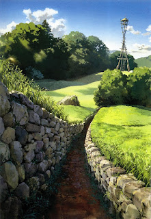
Studio Ghibli - Kazuo Oga

Studio Ghibli is one of my favourite animation companies, because I love the art style as well as their ability to transport me to another world through the use of unique characters and stunning background design. I also love that they are so imaginative and very much different from most animators/animation studios that I am used to watching, which is what I would like to aspire to achieve; Imaginative story lines and stunning visuals (although maybe not to the extent that Studio Ghibli does at this stage).

http://i.imgur.com/pKr5sdl.jpg
Evgeny Lushpin

Evgeny (Eugene) Lushpin is an artist from Moscow who paints beautifully realistic scenes, and I've chosen to talk about his work because he is often recognized as "The Master of Light" and this is something I would like to touch on myself. I especially like how he paints his night scenes as he manages to capture the cold weather, yet the warm glow of lights from houses and street lights nicely contrasts with this. 

 Amanda Macfarlane (TheAnimatedLife)

I recently discovered TheAnimatedLife (Amanda Macfarlane) on Instagram and I really like the work she posts. She is a stay at home mum and Freelance Artist, who does a lot of character design that shows a wide variety, both in the media used and in the style and personality of her characters. For instance she has recently been drawing zombies and monsters but in the past has been known to create studies of her children. This is why I have chosen to feature her in this post. I want to continue to explore with my media to see the different effects these will have on my character design and I want to keep my options open in terms of style.


Ira Sluyterman van Langeweyde

Ira Sluyterman van Langeweyde (Iraville) is another artist I discovered on Instagram, whose character and environmental design is beautiful. She works predominately in water-colours and her style is consistent throughout her work but she still manages to create unique and different characters and landscapes.


Online Resources that demonstrate my interests in creative industries
theartofanimation.tumblr.com is a great blog that features work from a wide range of artists and animators, so ultimately has a massive range of styles. The work that is featured is usually of high quality and detail, and I like that the artists have considered the colour palettes that they use, much like I would like to. It's also great inspiration for background art in particular, as some of the space the artists have created are stunning.

zestydoesthings.tumblr.com is another blog that I am very fond of. The blog belongs to Toby Allen or "Zesty Does Things" and features all his work with the occasional post of inspirational work. He is very much inspired by Pokemon by the looks of things, and will often create his own interpretations of the characters, and as cute and well drawn as they are, I very much prefer his own work. I like his working style and how it is consistent across his pieces, yet he still manages to make each character unique.

Tumblr.com in general is a great website to use to find inspirations or to generate ideas, that is, if you follow the right blogs. It is a nice way to gather a range of different artists and art work into one space, as well as get your own work out there

Pinterest.com is another website that is great for this purpose, especially if you follow 'boards' that are relevant to you. It is full of concept art, character design etc. which is great for finding inspirations, but it is also very useful for finding good models to use as a reference for drawing.

Shortoftheweek.com is a website that I had stumbled across back on Art Foundation, but is one that I keep coming back to as I think it is brilliant. The team at Short of the Week discover and promote short stories/animations and feature one on their website every week, and you can even submit your own films/animations to them and it may even get promoted. They have also recently added in the option to search for topics/genres and different styles of animation making it much easier to find the types of things you are interested in.

Instagram.com - though more commonly a smartphone app - is a website that I have only recently got myself onto. I avoided it for so long as it had this reputation for a website filled with "'white girls' posting photographs of their food and Starbucks", but eventually gave into peer pressure and created an account dedicated to the work that I am producing. Again, now that I am following the 'right' people, Instagram is now a website/app that I can use as a source of inspiration and is actually something I find very useful.

Tuesday, 12 May 2015

Reflective Practice

Reflective Practice is a way of looking at your own work or that of others, to critically identify what we are doing and how well we are doing it. It's obviously very important that we do this so we can identify our strengths and weaknesses, and build upon them to improve in the future. We can also look at other people's work to either see why it was successful and how we can be successful in our own work, or the opposite and find out what we should avoid doing ourselves.


We were shown Gibb's Reflective Cycle which outlines how you can effectively criticise your practice/work. I find that it is a good guide to follow, and in the future I should refer to it more often when talking about my work especially when I am struggling on what to write. I think it will help me to easily identify what has gone wrong/right, and allow me to improve in the future. 

Effective Presentation Tips and Combating Presentation Anxiety

A long, long while ago, I sat through a presentation on how to give a good presentation. Where as I found a lot of the information to be self-explanatory - such as making the visuals easy on the eyes (easy to read and not using harsh colours for text/backgrounds) - I found the presentation to be extremely useful. It stressed the importance of knowing your audience,  and speaking to them as if they knew nothing about what you were presenting. This would encourage you to be informative about who you are and what you are doing/talking about, all the while being concise. But your slides shouldn't be a replacement of you, but instead be used as a way to point out key information in which you can build upon.

So Basically:

- Know your audience
- Know your subject
- Prepare yourself
- Don't use bullet points (irony)


We were also given a presentation on how to combat presentation anxiety shortly after. The nature of the presentation was practically the same, and basically told me to practice my material and try to remain calm though I did find this presentation to be a massive help when it came to doing my presentations for both Disseminate and Reflect briefs. It reminded me that I had to practice my material and to make sure I knew what I was talking about (which in hindsight I should have done more for my Disseminate presentation) and to remain calm.

Reflect: Presentation Day!

I'm really surprised at how well my presentation went today. I started to worry a bit when I couldn't get my speaker notes to work, and in the end I couldn't get it to and had to wing it in terms of notes. I found that because I was talking about my own experiences I didn't trip up over my words as much and I was much more confident at speaking. I think this is predominately down to the subject matter, but I'd also like to think that it's because I have gained confidence and presenting skills, which if so, I am thrilled about.

Ekko: People Waste a Lot of Time, Then, They Wish For More.

I know I've mentioned before that I enjoy playing the online game League of Legends, and that I really enjoy the animations that Riot Games release, but I'm going to briefly talk about their latest video. The animation is based on their new Champion Ekko, and it gives you an insight into what the character is going to be like. 

For starters, I appreciate that they are bring out more black characters to build on their diverse range of champions. I also like the design of the character (just like I like the design of pretty much all of the champions) and how even though he shares qualities with other champs, he still seems unique. 

Ekko: Seconds


I also like how the art/animation style in these videos by Riot differ from the actual game play, yet it still gives you an idea of how the character is going to be played. The videos are much more intense and they use a variety a different camera angles and shots to hook the viewers attention and to make the fight scenes more dramatic. This is obviously the complete opposite of the birds eye view that you get of the game when you play, and I like that these videos bring the gameplay to life in a different way to what I'm/you're used to.

Monday, 11 May 2015

The Animated Self: Completed Animation

After weeks of frustration, I have finally finished my animation. Once I had altered the hand positioning, I exported the animation so I could open the file up in Premiere and add sound. I found clips of birds chirping on a royalty free sound effects website, and downloaded the ones that I thought would be most suitable and had these play alongside the animation. I extended the first frame of the animation so that I could make the audio fade in before the movement of the character started. 

Prancing in Spring - Finished Animation

I know I had encountered a few problems along the way, but I'm glad I did as it has made me wiser and I will know to avoid them in the future, and how I can overcome them if I encounter them again. For instance photographing my frames using the correct camera settings. This definitely would have saved me a lot of time and consequently a lot of stress. Despite all this, I have been able to create an animation that I am proud of, one that in my opinion has realistic, fluid movements which I'm happy that I have been able to create. 

Sunday, 10 May 2015

The Animated Self: Animation is Nearing Completion!

I have really surprised myself with how much work I have managed to get done over the past three days. Today I have managed to get the visuals finished so now I am ready to start adding the finishing touches, such as sound, and maybe even a title introduction if needed. 

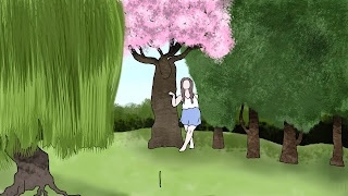
Today's focus was to get the drawing completed, so I started with the trees in the background, in particular the one in the centre. Originally I had pictured this to be an ordinary tree, but I got the idea to change it into a Cherry Blossom when I passed one in the car on the way home. I think Cherry Blossoms are so beautiful, and I thought including one in my animation would be a great way to brighten it up and add a variety of colour. 

Still of Cherry Blossom Tree 

To make the tree, I experimented with different brush presets until I finally found ones that looked like bark and leaves/flowers. It took me a while to do as there were so many different brushes and so many different ways I could use them, but once I had found my own way of working the rest of the trees (lined up on the right) were completed in no time, with the exception of the willow tree. As this tree had different leaves I had to experiment again with different brushes to find one that could mimic the leaves of a willow tree, as I didn't fancy drawing each individual strand. Again, I think I was successful at finding a tool that was useful, and I like that there is now a variety of texture in the background, making it more realistic and interesting to look at.

Still of Completed Trees

My next step was to finish the background, which was the easiest task of the day. I created the grass by using a number of different greens at different opacities and then created the sky by blending a light blue into an off white. I thought this looked okay but I felt that it was missing something. It didn't feel like it was a real place as there seemed to be no depth beyond the trees. I tried to overcome this problem by adding some sort of hedge or background scenery behind the trees, which I thought greatly improved the composition. In my opinion, this addition made the space much more believable as the world seemed to extend past this plane/set. 


Composition With and Without Hedge/Scenery

Now that my background was finished, I was ready to animate the trees that moved (The willow and the far left tree in the line of four). This was somewhat straight forward to do, as I simply had to make sure I used the same colours and brush presets for each tree. The willow was a bit harder to do, as I didn't really have a reference to work from, so I was unsure of how the leaves should have fallen. I gave it my best shot, and playing it back I think it runs rather smoothly. 
The next thing I had to do was to arrange my layers so that Maressa was positioned correctly amongst the trees. This meant that I had to dissect the video layer that she was created on into separate layers, three to be exact. I positioned the layer behind the cherry blossom tree, and I cut the layer once she had fully emerged from behind the tree. I then moved this second layer so that it was in front of the tree. I did the same thing for when she is at the willow tree, and moved the third layer in front of it once she had fully emerged so that she was positioned at the front of the composition. This didn't take long at all and it worked really well. (I have since discovered that I need to bring her hand forward in some of the frames, as it is still positioned behind the willow leaves. I noticed at the time, but completely forgot to implement). 

The next thing I added into the animation was more willow leaves when Maressa pushed them aside, because at the moment it looked as though it was 2D or that she was just brushing away the leaves at the edge. I added them in behind her character to make it seem like she was actually walking through the leaves rather than just walking up to a 2D layer of them and moving them aside.

Without Willow Back

With Willow Back


Once this was done I moved onto adding shadow, and I did so by using a similar colour to my grass and lowering the opacity. I started out by placing circles under her feet, making sure they got darker once they were closer to the ground and then I went over these with a larger circle for where the shadow for her body should be. I then adjusted the transparency of this layer until it was subtle enough for my liking. I didn't want it to stand out too much as I thought this would have brought attention away from Maressa. Even though it is only a subtle touch, I think it has worked wonders for my animation. It may not be entirely accurate as I was creating it from my imagination rather than any reference material, but I think it helps to create the illusion that she is moving throughout a 3D space rather than a 2D one.

Maressa's Shadows

I then thought that the tree's shadow in the foreground should move as its leaves are played with, so I drew them in on a separate video layer, but once I had finished them and played the animation back I wasn't too keen. I didn't think that the shadow was in the right place compared to the shadows of the other objects, and it didn't seem to move accurately/realistically. Instead of removing the work I had done, I simply made the layer invisible, in case I wanted to return to it.

Tree Shadow

Once I had finished the shadow I thought that was me finished in terms of visuals, but then I realised that I had somewhat messed up Maressa's layers. I noticed that when she pushes the leaves aside that her hand that does so isn't brought forward. I couldn't just move the positioning of the layer as this meant that she would be stood in front of the leaves too early. This means that I am going to have to make a separate layer for her hand so that I can bring that forward without moving her whole character. It won't take me long to do, and when I am finished with this I will be able to move onto post-production. 

Thursday, 7 May 2015

The Animated Self: Considering Sound

As well as colour, sound is something that I want to get completed in time for my deadline. I have been thinking about the different sounds I could include and I think my favourite idea is to have the sound of birds tweeting. I don't think I want to have a song playing as it won't last very long, and I think something that is more subtle will work better in this case, since I am testing movements rather than creating a narrative.

Another idea that had crossed my mind was having a slight breeze sound playing. I think this would be suited for the environment, but it would suggest that the trees should be rustling and may look odd if they don't. I shall have to experiment with different sounds to see what fits best, but I know I only want to have something subtle playing. If I get the chance I may revisit animating and make the trees move slightly in the breeze as this will be the icing on the cake, and it may make my animation seem a touch more professional for exhibition. Again, this is likely not going to be explored before my deadline as it is simply a final touch, and I don't think I will find the time, but if I do, I'll definitely aim to add this in if needed.

The Animated Self: Adding Some Colour

Colouring in the girl surprisingly didn't take that long, only about 2-3 hours roughly and because of this completing the entire animation in colour before my deadline doesn't sound like such a far-fetched goal. I think it could easily be achieved if I continue to work like I have for the past few days; fast paced and focused. 

Girl in Colour

Even though the colouring is only basic, I think it has greatly improved the piece and it has made me excited to see what it's going to be like in full colour. Adding the colour has also made me think about the positioning of the layers, as the girl weaves in and out of the scenery. I have broken the original layer into three separate layers (at the back, in the middle and at the front) so that when I colour in the background and the other components, I can arrange them accordingly so she will move around the props.

I think it would be nice to add a little bit of shading to the girl if I find the time once I have finished the rest of the colour. It's not going to be something I aim to get completed for my deadline however, as I think this will be pushing the workload I can handle. BUT we shall see how it goes.

The Animated Self: Drawing Frames Completed!

Once I had finished cropping my video, the animation was going to be a whopping 199 frames long. I got started with drawing and I was happy to be using paper again having been glued to a computer for so long. This happiness soon wore off once I had gotten a couple of days into the drawing. I was soon getting frustrated as the drawing was taking a lot longer than I had expected as I was taking a while to figure out the movements and trying to make her look realistic. However I powered on and worked out how many frames I was going to have to complete a day in order to finish with time to spare so I could edit the animation, which was roughly around 20/30. 

In the end I actually finished drawing a couple of days before I had planned to, and once I had I thought it would be best to photograph the frames using Dragonframe rather than using a scanner, as this would be a much quicker, less painful process. 

Photographs of Frames

This was the first time I had seen my animation run through and I was so happy with how it looked. It really made me feel that all the hard work and frustration was worth it. Obviously there was still work to do as the video had my hand in the odd frame, it was slightly orange and it wasn't cropped down to the right size.

First Edit of Frames

I edited the levels of the frames in Photoshop, and from here I was going to remove the surrounding background of the page, so I could incorporate a background that I was going to create based on my initial plan. I then realised this was going to be harder than I had first anticipated. I tried to click the background by using the magic wand tool, but it would select random parts of the background, even when I decreased/increased the tolerance of the tool. This meant removing the background was going to be quite difficult, and the only way I could see getting around this problem would be to use the eraser tool. This was going to be incredibly time consuming as it was going to be a fiddly job, so rather than do this I decided to rotoscope my drawn frames in Photoshop. The logic was that this would be quicker than using the eraser tool, and when it came to adding colour (hopefully) I would have a much smoother edge to work with. So I went at it.

Half way through Rotoscoping my drawn footage, Mike came to talk to me about my progress and asked WHY I was redrawing my frames. It was only then that I realised that my original photographs of my frames weren't shot at the right size. I then realised how much easier I could have made my work for myself. I knew when I started that there had to be an easier way around my problem, but because I couldn't figure it out I had started Rotoscoping not wanting to waste time, as I only had a week and a bit until my deadline. In the future if I am going to animate traditionally, I am definitely going to have to remember to check the settings of my camera because I could have said so much time had I have done this correctly the first time around.

First Rotoscoped Attempt

Even though this probably wasn't the easiest way to overcome the problem I had, I'm still very proud of my progress and how quickly I was able to get this finished. It only took me two days to Rotoscope all 199 frames and I'm still in a position where I can edit my animation further before my deadline. From here I need to sort out the fact that the lines in the background can be seen through the objects in the foreground. To do this I shall have to either erase them in each frame where appropriate, or I could fill the objects in. Both ways sound like they are going to be quite time consuming, and because I am aiming to have the animation coloured for our exhibition, it makes sense to me to just start colouring the frames now. 

I'm going to start by colouring the girl as she is predominately in front of the objects in the scene and this will sort my problem of the background showing through. From here I will then colour the background and add in any necessary details. 

The Animated Self: My Chosen Idea and Getting Started

I decided I wanted to create a 15-30 second animation of someone dancing, more precisely my sister. I wanted to have her wear a floaty skirt and dance around a space so that I could practice drawing realistic human movements, as well as animating follow through and overlapping actions. Before I asked her to film a reference video for me, I searched on Youtube for something that I/she could take inspiration from when it came to dancing around.


I didn't really find much of relevance, but then I stumbled across this video. It wasn't much help in terms of content but it did give me the idea to have Maressa (my sister) dance around the garden and emerge from behind trees as if she were in some sort of forest. 

When we started to shoot the videos, it didn't occur to me that the tea towel was going to obstruct the shot of Maressa prancing around. It was only until I saw her disappear behind it that I realised we would have to shoot another shot. I went to stop and move the tea towel out of the way, but by that point Maressa had used it as a prop and pushed it out of the way as if it was a bunch of tree branches/vines. She thought because I hadn't moved it out of the way that I wanted her to interact with it, so a simple mistake lead to a great idea. I kept the tea towel where it was and shot a couple of takes of her dancing around and interacting with the scenery. 


Chosen Reference Video (Rendered at 12FPS)

I then chose my favourite video out of the collection for me to work from, and uploaded it into Photoshop to change the frame rate. From here I could have easily Rotoscoped the sequence, and I was very tempted, but I decided that because I was out of practice with traditional animation that this would be the best thing for me to go for. I had also experienced Rotoscoping with my Applied Animation project so I thought it would be a good idea to try and keep the projects different.

Initial Plan

Before I got started with drawing, I planned out a 16:9 space and in it had a rough sketch of what I wanted the scene to look like. This meant I wouldn't have to struggle later at cropping down the image and trying to work out where she was going to interact with things. I made sure to have these frames at the bottom of my peg board, so I could animate Maressa over the top of them.

Monday, 13 April 2015

Reflect: More Progress

As I am going to mention the things that I have enjoyed doing, I thought it would be best to also mention the things I have disliked. I really didn't enjoy working with Flash as I couldn't get my head around it and I found it much harder to use than say After Effects. 

I was unsure how I was going to demonstrate this as an image when I got the idea to draw the icon for the program being thrown in the bin. Not only would this show my frustrations with the program and my disliking for it, but I thought it would also look quite comical. 


I went ahead and drew out my idea. It didn't take me very long to do as the components were very basic, but I think it demonstrates my point well. I also included this animation inside the reoccurring oval shape (even though I said previously I wasn't going to do this with my animated pieces) as I think it just finished off the animation nicely and I think it works this time around as it doesn't feel too cramped/"busy".

Reflect: Further, Further Progress

I wanted to talk about what I wanted to get out of the course and my time at University, and thought it would be best for me to demonstrate this by holding the programs I wanted to get better at using. I chose Photoshop and Maya as I like working digitally and also because I wanted to explore using 3D. I feel I have made a good start at doing so and I'm definitely looking forward to experimenting further in these fields. 
Finished Drawing

I was really pleased with my drawing, as again it was consistent with the rest of my presentation so far, and it was relevant to what I wanted to talk about. I was happy to leave it as it was, but I thought it might look better if I animated it slightly just to make it that little bit more interesting. I experimented with different brushes to add a glowing light shining from my hands, as well as moving the icons slightly to make it feel as though they were bobbing up and down/floating rather than just being stationary in the image. 

Finished GIF

I think the addition of these subtle movements has greatly improved the piece, as it gives the image more depth by making the icons stand out. It also draws more attention to the program icons which is a bonus as these are what I shall be talking about whilst this slide is being projected. 

Friday, 10 April 2015

Reflect: Further Progress

One of the things I wanted to mention in my presentation was my trip to York with Maressa for the environmental storytelling brief. I thought this was a really fun brief and thoroughly enjoyed producing work for it. To represent this in an image, I decided to draw me and my sister at the top of Clifford's Tower, making sure to finish the drawing with the circular border to keep the style of my presentation consistent. 


I really liked the drawing and for my own personal use I decided to extend past the circular boarder to finish the whole picture as if it was a photograph of us together. 

Another point I wanted to talk about in my presentation was that I had had many breakdowns/rough patches throughout the year. I thought this was one of the most important things for me to talk about because I have struggled at times but I have managed to get past the problems I have been having and pull through with my work and issues. It's something I have been battling with for a while and I'm slowly (but surely, hopefully) getting better at keeping cheery. 
I didn't want to draw something that wasn't as bubbly as the rest of my images as I didn't want to dwell on the hard times, instead focus on the overcoming of these rough patches. I thought of drawing a short animation that featured me banging my head on the table. I thought this was a nice way of showing my frustrations but does so in a way that could be quite comical and lighthearted. 


I didn't do any planning with this animation, I just went ahead and drew it and I think it turned out okay. Whilst I was drawing I tried to think about the twelve principles of animation to help me animate this action well, in particular Anticipation, Overlapping Action and Timing. I wanted it to seem as though the character was really slamming her head on the table rather than just resting it there, so I made her drag her head back and really push it down by drawing less inbetweens from the upright position to with her having her head on the desk. 

I initially just drew the main body of the character, leaving out the facial expressions. I was going to include these after I had finished the main bulk of the animation but I quite liked the look of it without the face. To me, it helps portray the mood as the face is just blank. Having said this, I think it would be beneficial to add these features in, but at this moment in time I don't feel it 100% necessary, so if I have a spare moment I may return to this and add them in.

Once I had finished the animation I tried putting the content inside a circle like the rest of my images so far, but I didn't like the look of it so removed it. To me it felt too cramped and brought attention away from the animation. It works well for my stationary drawings but just not in this case, so if I am going to draw more animations for my presentation, I shall keep the style consistent by having all GIFs/MOVs without a border. 

Tuesday, 7 April 2015

Reflect: Initial Planning and Progress

For this brief we are required to put together a presentation to show to the class that reflects upon the year we have each had at University. We are to look at our personal highlights and critically reflect upon our progress in the year. Not only this but we are to incorporate some of the animation skills we have learnt.

I decided that the best way to deal with this brief would be to write down all the things I want to talk about, and create an animation or illustration based on these points. This way, I will be able to provide a visual for the topics I shall be talking about, and also meet the requirements of the brief by incorporating some animation related skill. 

I figured the first slide would be the title/introduction to the presentation, so I started with that. As it was going to be all about MY year, I thought it would be a good idea to include a character based on myself in the illustrations, so I designed a title with myself included. 


Title Page: Original (Left) and Slightly Animated (Right)

I was really pleased with how it went, and I thought it would be nice to have all of the illustrations/animations in a similar style, so when I designed my next slide, I made sure to use a similar background to see if the consistent style would work well...

Highlight: Meeting Peter Lord at BAF

... and it seems to have done.

Monday, 6 April 2015

The Animated Self: Planning and Generating Ideas

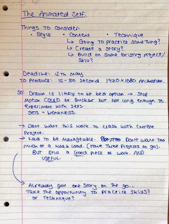
For this brief we are required to produce a short 15-30 second animation that reflects myself and my interests. It could also be an opportunity for me to build on existing skills, or to widen my range of skills by experimenting further, and I can do this by creating an animation on pretty much anything I like. 

At first, I really liked the sound of this brief, as I have total freedom with what I produce, but I soon realised I had ZERO ideas. Since the majority of my previous briefs have given me a topic to work with or at least a title to base my animation around, I found it incredibly hard to think of something. So I began making notes and brainstorming. 


I thought about my strengths & weaknesses and began to consider the different ways in which I could produce the animation. I thought about what programmes/methods would be best to produce certain things (e.g. animated logos, a short cartoon, etc.) in hopes that I'd at least decide on what I wanted to make. I decided I didn't want this animation work to clash with my current project, so instead thought it would be best to stay clear of after effects and work in another way. I then realised that I only have just above a month to complete both projects, so I decided that it would be best to build on my existing strengths rather than be adventurous and take the challenge of learning new ones. As much as I would have liked to do this, I don't want to get too stressed by creating too much work for myself; I'll be able to do more experimenting in the Summer holidays anyway.


I decided that I'd like to practice animating movement, either by traditional means or digitally. This won't require me to do weeks of planning to solidify an idea for a storyboard so I won't be rushed for time, and this way I can also focus on my animating. I think this will be beneficial to me as I haven't done a great deal of moving sequences, so I can use this time to practice this skill, which I can then relate to future projects. The idea sounds quite simple but I think it could be a good opportunity for me to produce some good work, especially if I really focus on capturing movement accurately. 

The only thing left for me to do is to decide what movements I'm going to animate. I'm leaning more towards the human form as I feel this will be the most beneficial and exciting, and also because I really enjoyed my life drawing sessions and would like to continue with this. I have made a list of all the different actions I could choose to look at (for example, dancing, jumping, running) and I will decide on which I want to continue with when I collect the reference videos I will need to draw from. From these I can also work out how many I'm going to need to animate to meet the requirements of the brief.