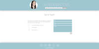
Website Pages
Again, I made sure to make my branding consistent across the pages and I think the end result looks really professional; at least I feel more like a professional now I have the website. I even bought the domain name.
I had to be really critical with the work I decided to showcase. I featured only stills from my films on my home page, making sure to leave out films/animations that weren't as strong. There are links to my other social media pages on every page of the website, so this work can still be accessed. I also scanned in a lot of work from my sketchbooks that I thought we good examples of linework and featured them on my portfolio page, along with work in progress images, pre-production art boards and life drawing.
With my about me and contact me pages (where I have wrote about myself and addressed the audience/viewer) I tried to have a good balance of professionalism and insight into my personality, to try and get across that I'd be a friendly person to work alongside. Not only that, but I have my CV and position statement for me to be formal, so I wanted my website to be more of an insight to how I am as a practitioner.
I'm very pleased with my website, and have since tweeted about it, and updated my social media with a link to the site address in my Bios.


No comments:
Post a Comment