Showing posts with label Position. Show all posts
Showing posts with label Position. Show all posts
Wednesday, 24 May 2017
Tuesday, 23 May 2017
Creating a Website
I thought it would be a good idea for me to make my own website. It's a great platform to showcase all of your work and contact information, and when done well can be very professional. I thought it would give me the upper hand for when I begin to contact studios looking for work/experience, and it will be easier for me to show them what I do with the use of a website too.


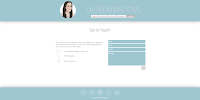


Website Pages
Again, I made sure to make my branding consistent across the pages and I think the end result looks really professional; at least I feel more like a professional now I have the website. I even bought the domain name.
I had to be really critical with the work I decided to showcase. I featured only stills from my films on my home page, making sure to leave out films/animations that weren't as strong. There are links to my other social media pages on every page of the website, so this work can still be accessed. I also scanned in a lot of work from my sketchbooks that I thought we good examples of linework and featured them on my portfolio page, along with work in progress images, pre-production art boards and life drawing.
With my about me and contact me pages (where I have wrote about myself and addressed the audience/viewer) I tried to have a good balance of professionalism and insight into my personality, to try and get across that I'd be a friendly person to work alongside. Not only that, but I have my CV and position statement for me to be formal, so I wanted my website to be more of an insight to how I am as a practitioner.
I'm very pleased with my website, and have since tweeted about it, and updated my social media with a link to the site address in my Bios.
Showreel 2017
My Showreel
For my showreel I have chosen to showcase clips from Kites, From a Child's Eye, Lifting Tower Projections, Marathon De Animation and A2 Milk. All of which are 2D which is how I want to market myself, so I left out the 3D work I did for Telling Tales, despite being proud of that work. I also left out other work that I have done in the past despite it being 2D (for instance my Changes in Gaming Infographic and previous loop de loop submissions), as I didn't think it was as strong as the work I have recently produced.
I don't have to worry about copyright with this showreel, as I asked Cameron, a music student from LCoM, whether he'd be interested in making a track for me. I was delighted with the results, and I think it has greatly improved my reel. It conveys a tone-of-voice which I think is very suited to my work and my personality; friendly and lighthearted.
Overall I'm really pleased with my showreel. I think it showcases my best work very well and gets across my character animation focus. It also shows my engagement with live briefs and external experiences outside of university, which can be used as a conversation starter for potential interviews.
Monday, 22 May 2017
Business Stationary Pack
I made a letterhead with a similar theme to my invoice. I made sure that my logo didn't take up too much room on the page, and that my contact details were clear and eligible. Again, I think the document looks very professional, and I can see this being very useful for the future as I will have to contact a lot of companies in search for experience and/or work.
I also made sure to make a black and white version to make sure it was still tangible in monochrome.


I also made sure to make a black and white version to make sure it was still tangible in monochrome.


Letterheads

Business Stationary
Here I have put together a mock-up of all my business stationary, complete with letterhead, business cards, pin badges, showreel work and invoices. I'm really pleased with the consistency in my brand and how much more professional I feel as a result.
Sunday, 21 May 2017
New Business Cards!
As I have updated my logo and general branding, it only made sense for me to update my business cards too. I was generally happy with the layout of my old cards, but tweaked the design slightly so it was more suited for my current branding.


New Business Card - Front and Back
The logo and font is consistent, although this time I made sure to have the text larger and bolder. Though the card I made previously looked good online, it was much harder to read the physical copy. I also decided to leave out my social media handle, but featured my website address instead, where links to my social media can be found if needed.
I haven't yet printed any of this design as I still have cards left, and it would be a waste to not use them as they were quite expensive. When I run out of old cards, I will be able to print new ones with my new design.
Subscribe to:
Posts (Atom)